The fuller an inbox, the less likely it is that any one email will stand out. That’s why it’s imperative that you craft emails that evoke excitement, necessity, and urgency. When every word and direction in an email walks the reader through the steps, your marketing campaigns will be that much more successful. An email marketing call to action (CTA) is the cornerstone of a good email, and everything leading up to it should compel the reader to click on it.
A successful CTA is composed of several tactical but approachable steps.
Determine the Value to Your Customers
Before you draft a good call to action, you have to figure out what the value is for anyone who clicks on it. It establishes the action you want your readers to take. Ask yourself:
- What do I want the recipient of the email to do?
- Why should they do it?
- How many steps do they have to take before the payoff?
From there, you can begin writing the body of the email that will prompt recipients to click the CTA.
Keep in mind that readers don’t want to feel like they’re making a huge commitment when click your CTA. Anything that implies spending money on their part is less likely to get clicks. Don’t stress them out; invite them in.
Something like “Try it free” or “Get your free sample” is much more welcoming than “Buy Now.”
Create High-Value Content
The other side of the CTA should not be a generic product page. Offer cool, exclusive marketing collateral that educates and entertains the reader.
The collateral can take on multiple forms:
- White paper
- eBook
- Video presentation
- A unique offer for a product or service
The content will vary depending on what kind of industry your business is in. B2C collateral is emotionally engaging and entertaining. B2B collateral equips the customer with better ways of growing revenue and/or working more productively.
Place the CTA Strategically
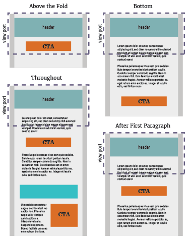 The location of the CTA depends on the flow and length of your email body. “Above the fold” is a good rule of thumb, but it’s not always applicable.
In the case of a long email that contains a lot of important information, putting the CTA near the bottom—below the fold—will result in a higher click-through rate.
If your email is long, it can be assumed it contains a lot of information your customers will have to go through. Some might apply to one group of customers, while another section might apply to a different group. When you’re in this kind of a situation, consider where else the CTA can be placed, or if you need to place multiple CTAs throughout the content.
You can place it early in the email after the first paragraph that describes what the email is all about. This helps you better catch contacts whose interest is already piqued.
Place it throughout the rest of the email too, after multiple paragraphs or on the side of the email, to enhance its visibility.
When an email contains multiple, related offers, devote a CTA to each one, and place it beside or just below the offer to keep everything connected to one another.
Wherever you decide to place the CTA, make sure it’s sitting in a position where the reader can understand everything they’re getting when they click. Clicking a CTA before reading through all of it might cause people to regret clicking it.
Design the Call to Action With Care and Consideration
You want your call to action to stand out, but that’s all the more reason to make it simple.
The language should be short and direct—no more than a few words. The body of the message has already done the explaining.
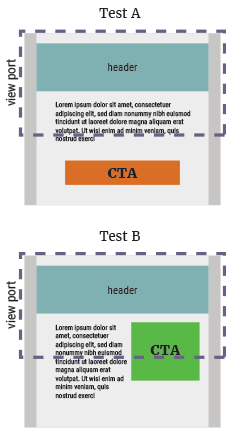
The design of the CTA should be simple and streamlined. The “button” has long proven to be the standard design. Anything else is simply less effective.
Images, in particular, are bad CTA design. The people on your mailing list likely have settings that block images in emails, which means your CTA will get blocked.
The button is durable, it stands out, and it compels people to do what they normally do when they see buttons—click it.
The button also makes the CTA stand out. Generic text with a hyperlink runs the risk of getting lost in the rest of the email and less likely that the reader will see it. The CTA should be bold, and placing it as a button makes it so.
The button also stands up to mobile testing. Other factors in the email might need to be changed, depending on how it looks on a mobile phone, but the button remains the same. Plus it typically allows for a larger click area over a text link.
The call to action is maybe the single most important part of the email, so it’s important that it stands out. The color is an easy and effective way of helping it contrast from the rest of the email. Choose a pigment entirely different from everything surrounding the CTA so that the reader sees it instantly.
Whitespace around the CTA also distinguishes it from the text and imagery. Stuffing the button into the body without regard to the surrounding environment can cause it to become lost or distort the design integrity of the email. Whitespace brings it into greater focus.
Test Your CTA Before Settling On One
 You might have multiple ideas for your CTA. The good news is, you can test all of them before committing to one.
A/B testing lets you compare two different versions of your email at a time by how they perform before you ever send it out to your full email list.
There are several specific variables to test your CTA for:
- Copy text
- Colors
- Placement on the page
The more testing you do, the clearer vision you will have for the final draft of your CTA. You can employ A/B testing for the rest of your email as well. Try different text for the body copy and different images to see which resonate with your customers more strongly generating more clicks.
The CTA is such an important part of your email marketing campaigns. Everything, before and after clicking on it, should revolve around the CTA, and it needs to make the reader’s decision to click feel worth it.
In email campaigning it’s a careful balance of understanding the behavior of your audience, their likes and dislikes, and practical design. But following these steps will set your call to action up for greater success.